本文总结利用pheatmap包绘制热图。
1. 先构造基因表达的原始矩阵数据
1 | library(pheatmap) |
2. 绘制热图
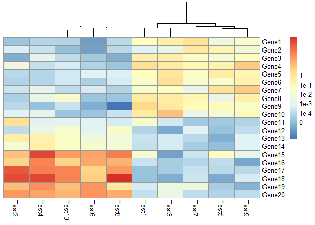
默认参数:
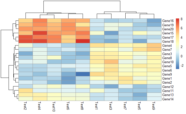
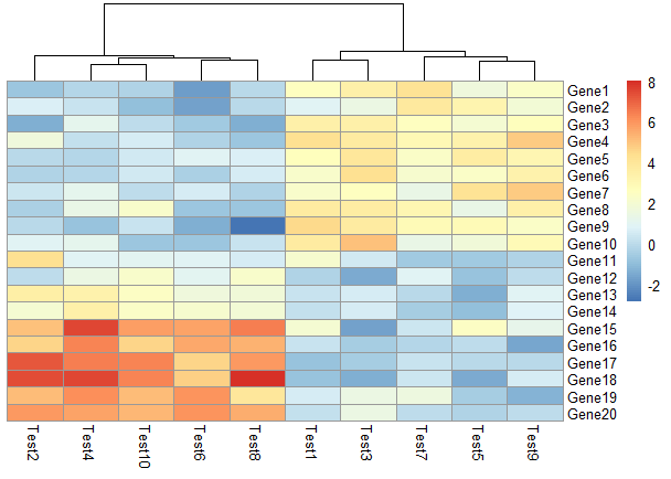
1 | pheatmap(test) |
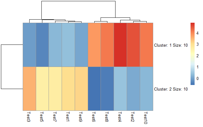
设置聚成几类
1 | pheatmap(test, kmeans_k = 2) |
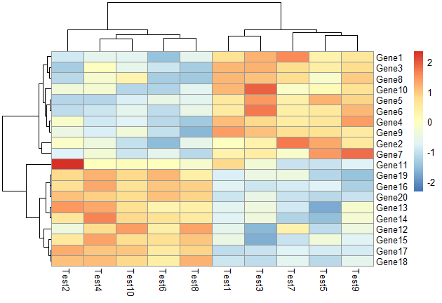
根据行进行scale,对行根据相关性进行聚类
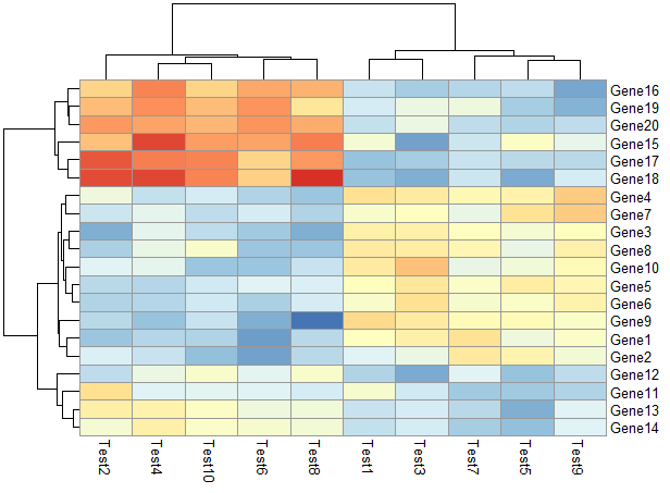
1 | pheatmap(test, scale = "row", clustering_distance_rows = "correlation") |
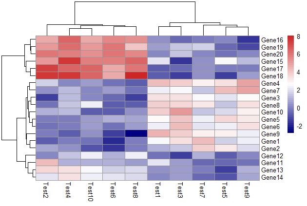
修改颜色
1 | pheatmap(test, color = colorRampPalette(c("navy", "white", "firebrick3"))(50)) |
不对行进行聚类
1 | pheatmap(test, cluster_row = FALSE) |
不显示图例标签
1 | pheatmap(test, legend = FALSE) |
显示相关性数字
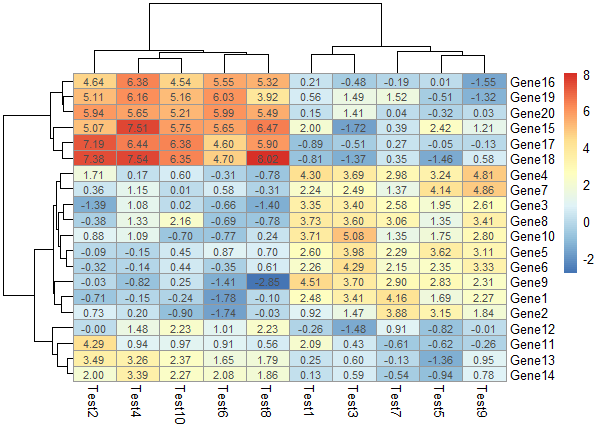
1 | pheatmap(test, display_numbers = TRUE) |
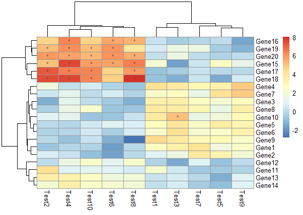
不显示数字,对符合要求的格子用符号表示
1 | pheatmap(test, display_numbers = matrix(ifelse(test > 5, "*", ""), |
修改图例
1 | pheatmap(test, cluster_row = FALSE, legend_breaks = -1:4, |
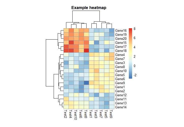
main设置标题、cellheight、cellwidth设置格子宽度和高度
1 | pheatmap(test, cellwidth = 15, cellheight = 12, |
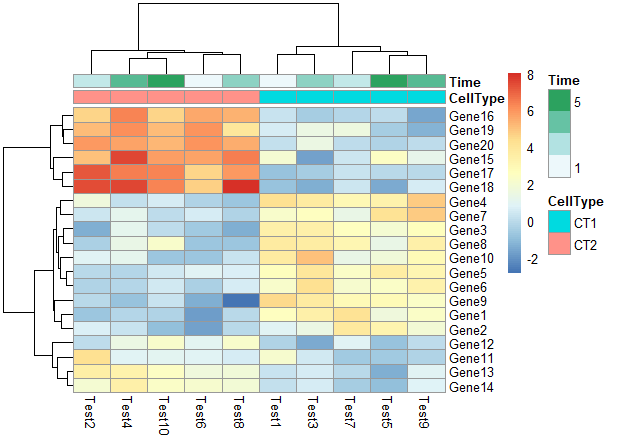
3. 对行和列进行分类注释
首先构建行和列分类的dataframe。
1 | # Generate annotations for rows and columns |
修改行分类标签
1 | pheatmap(test, annotation_col = annotation_col) |
不显示行分类标签的注释的legend
1 | pheatmap(test, annotation_col = annotation_col, annotation_legend = FALSE) |
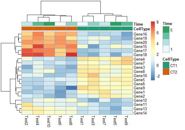
修改行分类标签和列分类标签
1 | pheatmap(test, annotation_col = annotation_col, annotation_row = annotation_row) |
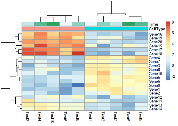
修改列名角度
1 | pheatmap(test, annotation_col = annotation_col, annotation_row = annotation_row,angle_col = "45") |
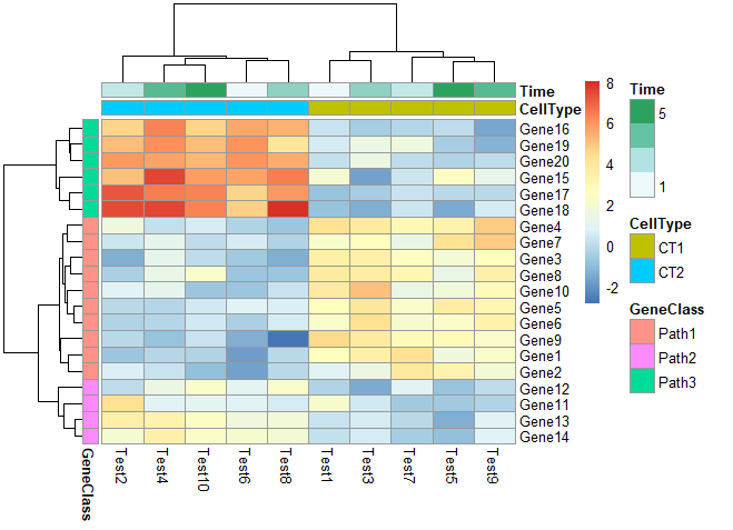
4. 修改行和列的分类颜色
1 | ann_colors = list( |
颜色与ann_colors一一对应
1 | pheatmap(test, annotation_col = annotation_col, |
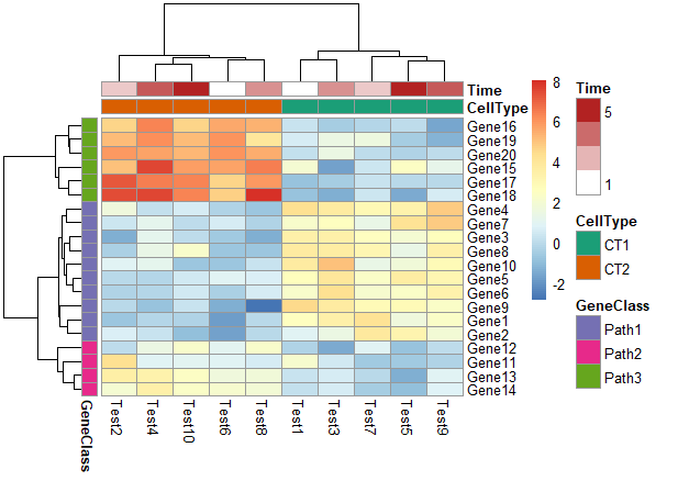
颜色为ann_color[2]
1 | pheatmap(test, annotation_col = annotation_col, |
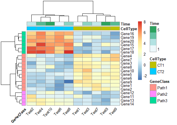
5. 修改行名、列名
1 | labels_row = c("", "", "", "", "", "", "", "", "", "", "", "", "", "", "", |
6. 其他
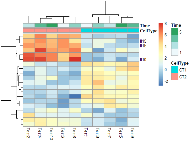
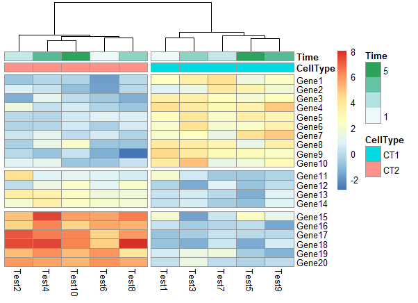
在热图中根据聚类添加gap
1 | pheatmap(test, annotation_col = annotation_col, cluster_rows = FALSE, gaps_row = c(10, 14)) |

1 | pheatmap(test, annotation_col = annotation_col, cluster_rows = FALSE, gaps_row = c(10, 14), |
1 | # Specifying clustering from distance matrix |