本文总结一下基于ggplot2包绘制各种类型的图,本文包括:棒棒糖图、哑铃图。
1. 棒棒糖图
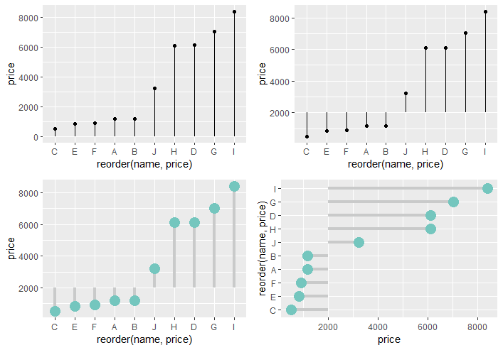
棒棒糖图本质是点图加上柱状图/线段。
1 | data <- diamond[c(1:10),] |
绘制散点加线段。
1 | ggplot(data,aes(x = reorder(name,price),y = price))+ |
修改y轴基线更改设定的阈值。
1 | ggplot(data,aes(x = reorder(name,price),y = price))+ |
美化:
1 | ggplot(data,aes(x = reorder(name,price),y = price))+ |
翻转,横向棒棒糖图:
1 | ggplot(data,aes(x = reorder(name,price),y = price))+ |
ifelse修改指定感兴趣的点的样式:
1 | ggplot(data,aes(x = reorder(name,price),y = price))+ |
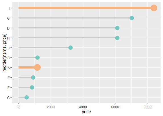
如果想要不同的颜色,那么加一个分组变量即可。
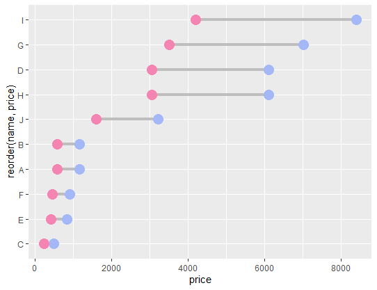
2. 哑铃图
哑铃图本质是不同分组的点图加两个点之间的线段。
1 | data |
构造数据:
1 | data$price2 <- data$price/2 |
参考资料: