本文总结一下ggplot2包绘制各种类型的图,本文包括:饼状图、环状图、雷达图、山峦图。
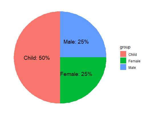
1. 饼图 1 2 3 4 5 6 7 pie_df <- data.frame( group = c ( "Male" , "Female" , "Child" ) , value = c ( 25 , 25 , 50 ) ) pie_df$ percent <- paste0( pie_df$ value, "%" ) pie_df group value percent 1 Male 25 25 % 2 Female 25 25% 3 Child 50 50 %
1 2 3 4 5 6 ggplot( pie_df, aes( x= "" , y= value, fill= group) ) + geom_bar( width = 0.5 , stat = "identity" ) + coord_polar( theta= 'y' ) + theme_void( ) + geom_text( aes( y = value/ 2 + c ( 0 , cumsum ( value) [ - length ( value) ] ) , label = paste0( group, ": " , percent) ) , size= 5 )
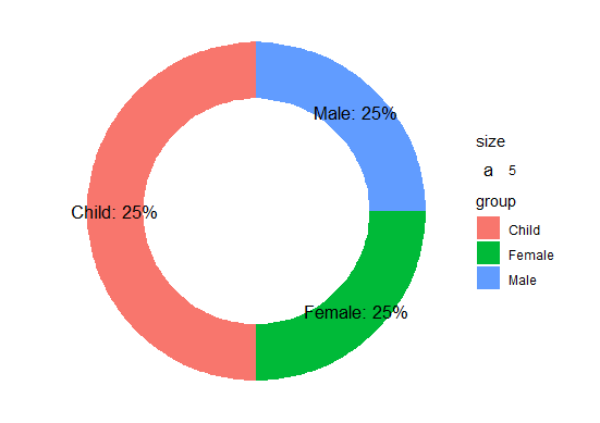
2. 环状图 本质是根据y轴进行极坐标转换,因此绘制环状图时,需要一些假数据。
1 2 3 4 5 6 7 8 9 10 pie_df <- data.frame( group = c ( "Male" , "Female" , "Child" , "Male" , "Female" , "Child" ) , value = c ( 25 , 25 , 50 , 0 , 0 , 0 ) , x= rep ( c ( "T" , "F" ) , each= 3 ) , percent= c ( "25%" , "25%" , "25%" , "0" , "0" , "0" ) ) pie_df group value x percent 1 Male 25 T 25 % 2 Female 25 T 25% 3 Child 50 T 25 %4 Male 0 F 0 5 Female 0 F 0 6 Child 0 F 0
给环状图加标签时,只对真实数据添加label,假数据label设置为空。
1 2 3 4 5 6 ggplot( pie_df, aes( x= x, y= value, fill= group) ) + geom_bar( width = 0.5 , stat = "identity" ) + coord_polar( theta= 'y' ) + theme_void( ) + geom_text( aes( y = value/ 2 + c ( 0 , cumsum ( value) [ - length ( value) ] ) , label = ifelse( value> 0 , paste0( group, ": " , percent) , "" ) , size= 5 ) )
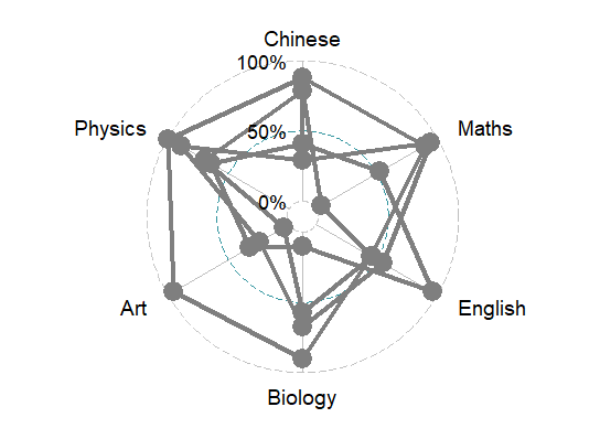
3. 雷达图 雷达图用ggplot2的扩展包ggradar包绘制。
1 2 devtools:: install_github( "ricardo-bion/ggradar" , dependencies= TRUE ) library( ggradar)
1 2 3 4 5 6 7 8 set.seed( 123 ) mydata<- matrix( runif( 24 , 0 , 1 ) , 4 , 6 ) rownames( mydata) <- LETTERS [ 1 : 4 ] colnames( mydata) <- c ( "Chinese" , "Maths" , "English" , "Biology" , "Art" , "Physics" ) mydf <- data.frame( mydata) Name <- c ( "ST1" , "ST2" , "ST3" , "ST4" ) mydf <- data.frame( Name, mydf, stringsAsFactors= FALSE )
1 2 ggradar( mydf, grid.line.width= 0.5 , background.circle.colour = "white" )
但是不知道为什么没有区分颜色,用group.colours也无法修改。
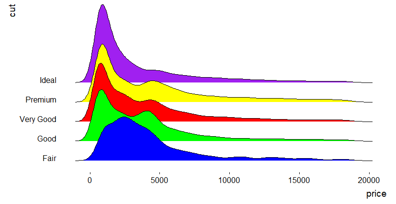
4. 山峦图 1 2 3 4 5 6 7 8 9 10 11 12 library( ggridges) head( diamonds) carat cut color clarity depth table price x y z < dbl> < ord> < ord> < ord> < dbl> < dbl> < int> < dbl> < dbl> < dbl> 1 0.23 Ideal E SI2 61.5 55 326 3.95 3.98 2.43 2 0.21 Premium E SI1 59.8 61 326 3.89 3.84 2.31 3 0.23 Good E VS1 56.9 65 327 4.05 4.07 2.31 4 0.29 Premium I VS2 62.4 58 334 4.2 4.23 2.63 5 0.31 Good J SI2 63.3 58 335 4.34 4.35 2.75 6 0.24 Very Good J VVS2 62.8 57 336 3.94 3.96 2.48
1 2 3 4 ggplot( diamonds, aes( x= price, y= cut, fill= cut) ) + geom_density_ridges( scale= 4 ) + scale_fill_cyclical( values = c ( "blue" , "green" , "red" , "yellow" , "purple" ) ) + theme_ridges( grid = FALSE )
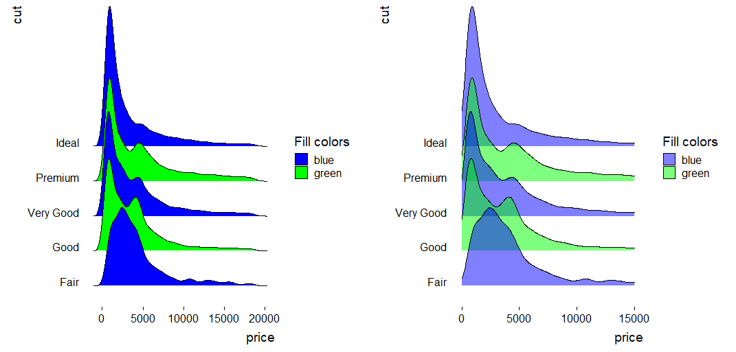
通过scale_fill_cyclical()修改颜色,添加图例,并修改图例标签:
1 2 3 4 5 6 ggplot( diamonds, aes( x= price, y= cut, fill= cut) ) + geom_density_ridges( scale= 4 ) + scale_fill_cyclical( values = c ( "blue" , "green" ) , guide= "legend" , labels= c ( "Fair" = "blue" , "Good" = "green" ) , name= "Fill colors" ) + theme_ridges( grid = FALSE )
修改颜色透明度,以及x轴的范围
1 2 3 4 5 6 ggplot( diamonds, aes( x= price, y= cut, fill= cut) ) + geom_density_ridges( scale= 4 , alpha= 0.5 , from= 0 , to= 15000 ) + scale_fill_cyclical( values = c ( "blue" , "green" ) , guide= "legend" , labels= c ( "Fair" = "blue" , "Good" = "green" ) , name= "Fill colors" ) + theme_ridges( grid = FALSE )