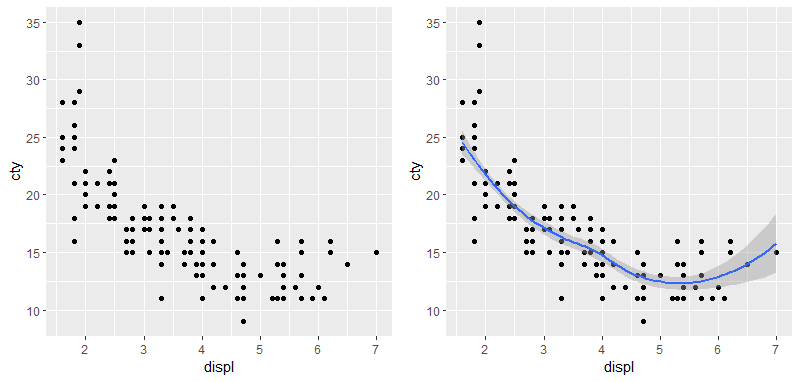
head(mpg) # A tibble: 6 x 11 manufacturer model displ year cyl trans drv cty hwy fl class <chr><chr><dbl><int><int><chr><chr><int><int><chr><chr> 1 audi a4 1.819994 auto(l5) f 1829 p compact 2 audi a4 1.819994 manual(m5) f 2129 p compact 3 audi a4 220084 manual(m6) f 2031 p compact 4 audi a4 220084 auto(av) f 2130 p compact 5 audi a4 2.819996 auto(l5) f 1626 p compact 6 audi a4 2.819996 manual(m5) f 1826 p compact
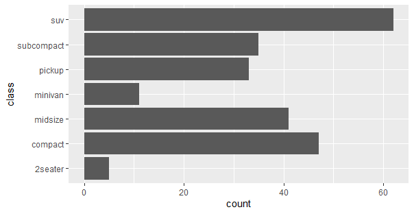
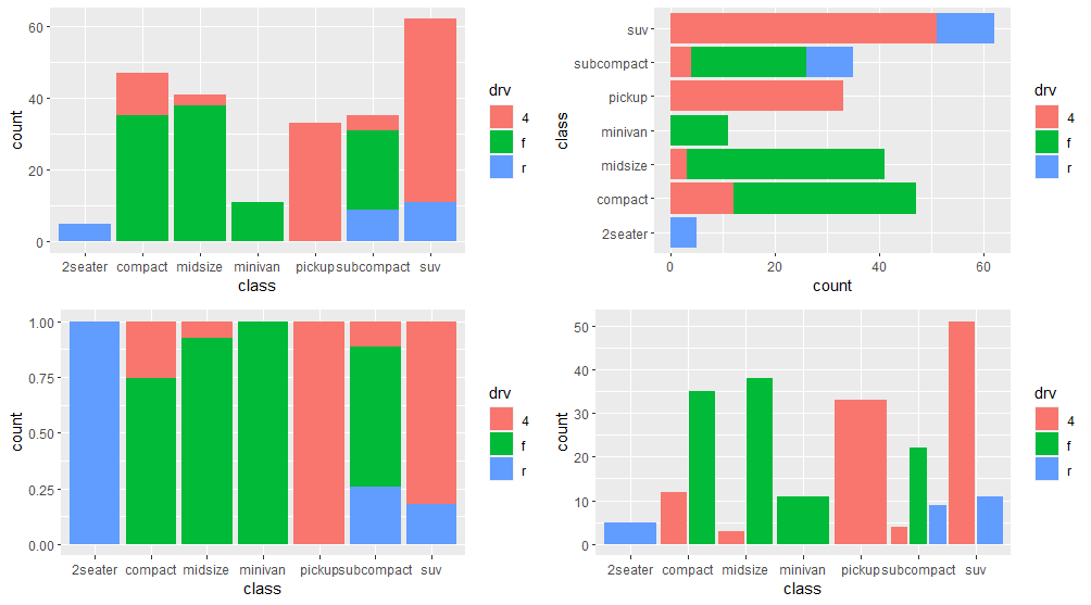
ggplot(mpg, aes(y =class))+ geom_bar(aes(fill = drv), position = position_stack(reverse =TRUE))
2.4 百分比条形图
1 2 3
ggplot(mpg, aes(class))+ geom_bar(aes(fill = drv), position ='fill')
2.5 并列分组条形图
1 2
ggplot(mpg, aes(class))+ geom_bar(aes(fill = drv), position = position_dodge())
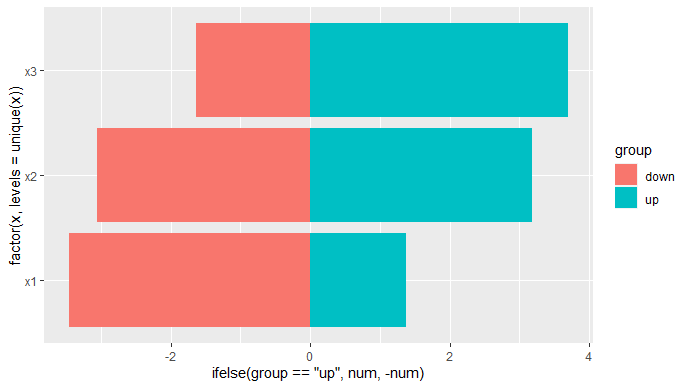
2.6 双向柱状图
1 2 3 4 5 6 7 8 9 10 11
df <- data.frame(x=rep(c("x1","x2","x3"),each=2), num=rnorm(6,mean =3), group=rep(c("up","down"),3)) df x num group 1 x1 1.377343 up 2 x1 3.456258 down 3 x2 3.184073 up 4 x2 3.057976 down 5 x3 3.692116 up 6 x3 1.633762 down
1 2 3 4 5 6
ggplot(df, aes(x = factor(x,levels = unique(x)), y = ifelse(group =="Up", value,-value), fill = group))+ geom_bar(stat ='identity')+ coord_flip()